Quantcast

A Georgia Peach Takes a Bite of the Big Apple II


Thank you for your comments and emails regarding Part I of my New York weekend trip and now for part II:

On Sunday, we headed to Brooklyn for a fantastic church service at the Brooklyn Tabernacle...
In 1997, the Brooklyn Tabernacle purchased the dilapidated Loew's Metropolitan Theatre and three adjacent buildings.  According to Architectural Record's Building Type Study, the architect faced the challenge of unifying the facade of the building as well as unifying the interiors of each building.  Here's a fun fact:  A tattered piece of fabric found during demolition provided the color scheme for the interior decorative paintings as well as the custom fabric designs for the seating and acoustical panels.
 images via Brooklyn Tabernacle
I would me remiss if I failed to mention that the Brooklyn Tabernacle is the home to the six Grammy Award winning Brooklyn Tabernacle Choir.  The choir consists of untrained voices from various multicultural and socio-economic backgrounds. And their voices...angelic and resounded through the cathedral as well my heart. I will definitely return here on my next visit. Also while in Brooklyn I visited the home of a new design client!  I'll keep everyone updated as the project progresses.

Lastly, I recommend everyone to visit and donate to the 9/11 Memorial & Museum at the World Trade Center.  At the 9/11 Memorial Preview Site the admission is free and visitors can learn about the plans and progress of the Memorial and Museum currently being built at the World Trade Center site.
images taken by Monique G.
It's amazing to me how the twin towers stood tall in what seems such a small lot. While we still mourn the lives lost, the museum helps visitors to also stand tall and creates feelings of optimism regarding the future.  Please click here to visit the website and to view the renderings for this bittersweet memorial.

Thank you readers for your recommendations on places to see/visit while in NY. I may not have had the opportunity to visit them all, but there are on my list for the next time!

A Georgia Peach Takes a Bite of the Big Apple


A few days before I left for New York I decided to perform "The Big Chop!"  It was a surprise to some and a flashback for others who have known me for years. I've already received quite a few emails from you all, my readers, in support of my new 'do!  Thanks for the love!

My best friend Keshia happens to be on assignment in New York and invited me up for the weekend.  I hadn't realized until I was on the plane that it was my first time being away from my children overnight!  This trip was long overdue.  I arrived to New York just enough time to get changed and prepare for dinner.  Our reservations were at Tao New York, touted as the largest and most popular Asian restaurant in New York City.  According to their website, Nicole Kidman, Tom Cruise, Madonna, Jay-Z and Beyonce amongst other celebrities are frequent diners here.  Even with reservations we waited a bit but were seated quickly before finishing my first cocktail.  Here's the scene in the first floor dining area.  Tao's towering 16 foot Buddha, fountains, koi pond, live DJ and saxophonist truly set the atmosphere and prepare you for the ultimate dining experience.
The food was definitely not your average neighborhood takeout.  It was absolutely delicious! Tao was still promoting their Restaurant Week Menu offering a three course meal for $35.  On my tab was the freshest Crisy Tuna Sashimi, Chilean Sea Bass, and Banana Bread Pudding.
 having cocktails at Tao

After dinner we had the greatest intentions to hit this place, but headed back to the W Union Square for a nightcap at Olives.

Day 2 started with breakfast (yes, we're eating again) at Pastis in Manhattan's Meatpacking District. I have a special affection for all things French so I was in heaven when we arrived at this place.
 
these images were captured by Monique (Aren't they gorgeous?)

This french bistro, another celebrity hot spot, has generous portions and is moderately-priced. The decor is French Provençal and could have very well been in the middle of Paris' St. Germain-des-Pres District.
The food was great! On my tab: Brioche French Toast with Fresh Fruit and Maple Syrup.  If I had known I'd be talking about food this much, I would've taken pics of my meals!

From Pastis, we ventured further into the West Village for a little shopping. If you love tailored yet girly frocks, suits, and coats you have to stop into Roni Boutique on Bleecker Street. Bob, our stylist, was a shopper's best friend. And if you happen upon a red brick wall while shopping, please by all means have an impromptu photo shoot!


Before we headed to SoHo for more shopping, we couldn't pass up a stop at Magnolia Bakery on Bleecker Street. If you are a Sex and the City fan, this is where Sarah Jessica Parker satisfied her sweet tooth for yummy cupcakes.

I'm a bit pressed for time today so I will have to leave you here with part 1 of my visit to New York City. Tomorrow I'll return with part 2.  Until then, click here to check out an interesting article about how a cupcake and "Sex and the City" turned Bleecker Street into prime real estate! Ciao!

On the Move: Headed to NYC


Thanks to everyone for such positive feedback on my Spring 2010 Color and Trend Report. In case you missed a day or if you are new to my blog here are the links:


Coral, Black, White + Bubbles
Oceanic Interpretations 
Freshly Squeezed Spaces with a Twist of Lime
Purple Rain + Botanicals


This by no means is this an all-encompassing list, just a fun series that encourages you to look at fashion and interior spaces from a different perspective.  After all, my goal for BluLabel Bungalow is to provide my readers with fashion-inspired interiors.  My focus is always on interior design and decorating, but in the future expect to see more post integrating fashion into the mix.


I'm off to New York City for the weekend to meet up with a few girlfriends and hopefully a new client (fingers crossed).  I won't be traveling first class this time *wink* but while I'm in my coach assignment, I'm pretending that I'm sitting here:

If anyone has suggestions on where to eat and shop for home decor be sure to leave it in the comment section or send me an email, thanks!  Have a great weekend everyone!

Spring 2010 - Purple Rain + Fresh Botanicals


The color purple is associated with royalty and nobility and might I add romance and femininity.  This spring's collection featuring purple ripped the catwalk in a big way.
garments l-r: Matthew Williamson, Andrew Gn, Oscar de la Renta

Purple has an ethereal quality that simply relaxes the atmosphere and puts you into a sensual mood.  How sexy would you feel wearing this dress?
garment: Matthew Williamson, room: Drake Design Associates

Rethink purple both in fashion and decor by pairing it with colors like Pantone's Aurora (mustard) and Dried Herb (olive green) as shown below.  The results are pleasantly surprisingly chic and sophisticated.
garment: Milly, room: Frank Roop

Or try purple with a twist of lime...How carefree and flirty is this tie-dye bikini. And this dressing table framed by billowy, grape hued curtains.

Single ladies, take the opportunity to decorate with purple before you walk down the aisle.  A bedroom like this is only a dream for me (vetoed the hubby), the closet on the other hand may be closer to reality.

Glam up your ladylike lounge and sitting room with shades of eggplant, lavender, and lilac...and with decor elements such as lucite, fur, and metallics.

 
You always know that spring has sprung when you see fresh flowers in the home and floral prints in spring collections.
garment: Tory Burch, room: Drake Design Associates

Botanical prints resurface in the form of wall decor and pillows as seen below.  Horchow has a beautiful series of glass decoupage trays by John Derian that would complement any space including the adjacent bedroom. The occupant could switch the wall decor with these (from Horchow) for a more "coastal" look.
 decor: Horchow, interior: Amanda Nisbet Design 

The pillow below, designed by Thomas Paul, would be great accent pillows for the above bedroom or just simply tossed on a sofa.
 Lastly, think on the perimeter of the box and consider wallcoverings in purple.  A little goes a long way!  These floral prints by Graham and Brown add a pop of color, interest, and dimension to a space.

Is purple in your decorating plan for next season? Are you looking forward to lush florals and fresh greens to grace your tabletops this Spring?

Spring 2010 - Freshly Squeezed Spaces with a Twist of Lime


Right about now I could use a little sunshine in my life.  But for now these sun-drenched runway styles and interior spaces put me into the mind of picking citrus in a beautiful Florida grove. Before you dismiss this little notion of a freshly squeezed space, consider the many shades of yellow...mustard, maize, marigold, and ochre.  Now consider orange...tangerine, amber, peach, and rust and combine them with neutrals such as gray, cream, black, and khaki.
 garments l-r: Rosa Chá (swim), Eli Tahari, BCBG

Sunkissed interiors combined with black, white, and gray lends more to the creation of a space that is more contemporary versus country. Also note the use of the clean, simple greek key pattern used on the accent pillows and the zebra print rug. The wallpaper also contains a simple, monochromatic diamond pattern that compliments, not competes with other design elements in the room.
 rooms David Jimenez  

 room via Southern Living, garment Chado Ralph Rucci

Orange, as seen below, is totally livable AND wearable when paired with neutrals.  Espresso, black, cream, and khaki allows orange to gracefully take center stageCheck out her this model's printed pumps...I'm utterly smitten and convinced that EVERYONE could use a little animal print in their lives!

 
room Kelly Hoppen, garment Dries Van Noten

The presence of orange in a neutral space can also bring warmth to an otherwise cold room.

 
I love to see when traditional furnishings are given an attitude adjustment. Orange gives these pieces an exciting new life and reveals a little about the personality of its owner.
room Horchow, photography Jean Randazzo
 
And I almost forgot to mention green in the midst of my citrus obsession.  Lime, dried herb, mint, kelly, olive, chartruese, I could go on forever. Below is one of my favorite color combinations using green.  This space is one of my top pics because it's gender neutral. Get a load of that lime green console...leaves me clutching my pearls!  My hubby would love this model's ensemble, exposed shoulders, mini-dress, fishnets, and wrapped with a bow...yowza!
room Taylor Howes, garment Andrew Gn

  So what are your thought on citrusy color palettes? Do they exist more in your home or in your wardrobe?


Spring 2010 - Oceanic Interpretations + Understated Elegance


Christian Siriano's Spring 2010 collection was my all time favorite from New York Fashion Week back in September.  The inspiration for this line came from the notion of Mediterranean travel and rich coastal sunsets as seen from a yacht.  This living room, featured in House Beautiful and designed by Tobi Fairley, has an understated elegance characterized by its sophisticated layers of pale blue tones and use of lush textiles.


Sumptuous spaces are created through the use of metallic finishes in furnishings and fabrics.  These finishes shimmer and sparkle and give the appearance of luxury and opulence.  Both ensembles have reflective qualities that really turn up the glam factor.  In this bedroom also designed by Tobi Fairley, the sunburst wall decor as well as the mirrored furniture pay homage to old Hollywood glamour while this Siriano design features a shiny silk blouse paired with a metallic short and topped with a distressed sun hat...so elegant and yet so unpretentious.

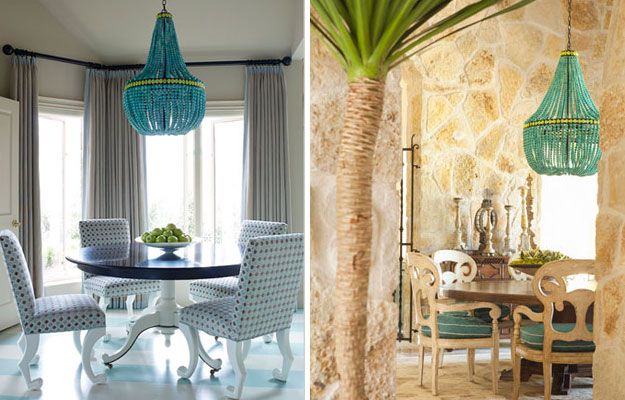
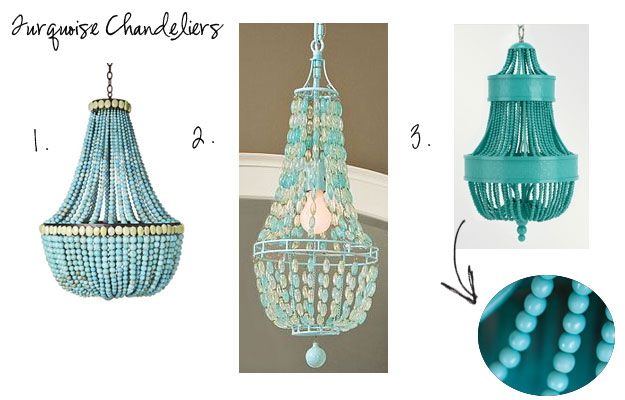
Turquoise, Pantone's color of the year, it making a statement in both residential and commercial spaces, but what I'm loving right now is this turquoise empire chandelier.


There is even a less expensive version at Pottery Barn Teen.  It's definitely cute enough to make a style statement in a teen's room, but not in a dining space.
1. Turquoise Empire Chandelier, Marjorie Skouras Design  2. Glass Bead Chandelier, Pottery Barn Teen 
3. Catalonia Small Chandelier, Shine by S.H.O

Lastly, here's a refreshing color palette using Sea Glass and two of the Pantone forecast colors, Tomato Puree and Dried Herb. Using Sea Glass in lieu of Turquoise escapes the retro look and arrives to one that is more meditative and calming.  Tomato Puree replaces classic red and Dried Herb is said to be "the ultimate green neutral pairing well with all other colors."


Do you find inspiration from the ocean and sea? How has the ocean found its way into your decor? What is your idea of Understated Elegance? Are you enjoying these posts as much as I am?

Spring 2010 - Coral, Black, White + Bubbles


Let me first start this week by welcoming my new readers joining me from Maria's blog.  I received so many positive comments and emails regarding last week's interview which says a lot about her following.   

I also want to send a special thank you to Lisa at Destination Seaborn for featuring BluLabel Bungalow this past Friday! After reading her post, it made me feel great to know that my vision for BluLabel Bungalow is being communicated clearly and that you love it! Please visit Lisa's blog, here.

Moving on...today, in the midst of another threat of snow, I am dreaming of Spring.  And what does Spring 2010 bring in terms of trends and colors in home decor? Based on the Pantone Fashion Color Report for Spring 2010, our wardrobes are expected to contain these colors:

As seen below, Tory Burch's Spring 2010 Collection features "fusion coral" and is inspired by resort wear with bold colors, graphic patterns, and textures.  Resort wear as it translated into home decor tends to teeter on the edge of whimscial and sophisticated as illustrated in these room designed by Lynn Morgan.  The introduction of coral against the stark contrast of bold black and white patterns breathes an element of playfulness.

 garments Tory Burch, rooms Lynn Morgan

Here is coral once again but this time paired with tan, another neutral. Warm neutral walls temper the room while still allowing coral to exist (floor to ceiling) as the dominate color. The watery blue centerpiece is reminiscent of seaglass found on the beach.  It makes me wonder if the designer found inspiration for this room while combing the beach.


Also check out my previous post here where I recently used coral and neutrals in my client's home office redesign.

Regarding home decor trends, the sunbrust mirror continues to maintain its momentum as well as the presence of animal print (timeless, if you ask me).  What I'm excited about is the sculptural-like quality of "Bubble-Inspired" LightingVery contemporary, it still has a place in traditional home decor.  Eye-catching and lighthearted, it creates the illusion of bubbles floating through the air as well as enhancing the feeling of having an open space...proves that bubbly doesn't always come in a bottle.
 
1. floating bubble ceiling fixture, Possini 2. annika chandelier, Oly Studio 
3. bubble globe pendant chandelier, Robert Sonneman 4. bubble cascade table lamp, Possini

What other colors and trends do you see popping up in home decor for the Spring?

In Love...Happy Valentines Day!


In honor of loving the one you're with or even just loving yourself, here are a few thoughts on making this Valentine's Day and everyday special...

1. Fresh flowers

2. Candlelight

3. Put your overhead lights on dimmers
click here for a cheesy, yet effective demo!


4. Sensual, scented candles/oil burners

5. Music

6. High Thread Count Sheets

7. Photos and Momentos

8. Breakfast in Bed

Did I miss something? What ways do you like to make yourself or your significant other feel special?

Tastemaker Tuesday: Maria Killam, Colour Expert


I've been hooked on Maria's blog from the day I was introduced.  A wellspring of information, Maria has an artist's spirit and the heart of a teacher.  Her hugely popular blog discusses the ins and outs of color and does an amazing job of explaining color theory to her readers. Her informative and lighthearted posts have received well deserved mentions from the Washington Post Blog Watch five times with titles such as "The Right Way to Create Flow Using Colour" and "5 Questions to Consider When Selecting a New Colour for Your Kitchen." Each time I read one of her blog posts, I always leave with valuable design nuggets or a fresh prespective of the given subject matter. Maria's work and advice has also be featured in Alberta Home Magazine and BC Home Magazine.  So for everyone who is tackling design projects in the new year, I thought it would be the perfect time to introduce you to Maria Killam, a Canadian-born international colour designer, writer, editor, and colour theory instructor.  Thank you Maria for taking the time to give us this interview and for all of your assistance! Enjoy!- Erika


{Vancouver Color Queen, Maria Killam, on the cover of BC Home Magazine}


Erika Ward: Which colors inspire you the most?

Maria Killam: I love happy colours in any combination!

What 2010 design trend has you "rolling your eyes?"

Oversized flat screen televisions. They belong in Media Rooms, period.

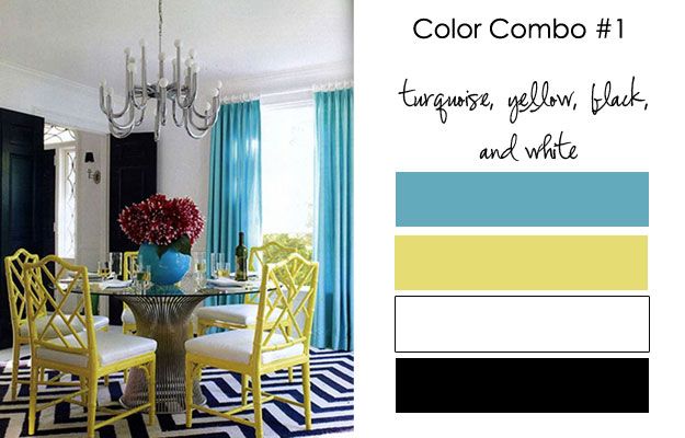
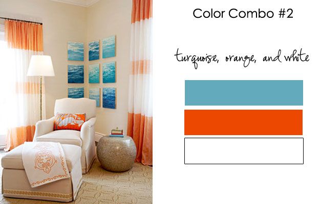
With turquoise as the Pantone Color of the Year, can you give us three color palettes that contain the color turquoise?

I love the sophisticated look of turquoise with black and white!  Here it is with the addition of yellow:


Turquoise, Orange, and White

 
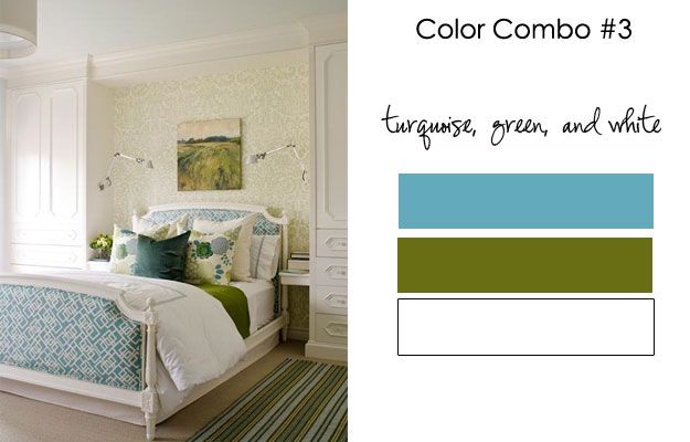
Turquoise, Green, and White


The combinations I've chosen all have white in them. I think white belongs with turquoise because white just looks best with fresh happy colours!

Not only do you give great color advice, but also great advice about being a blogger. What makes you so passionate about helping fellow bloggers?

I'm generally obsessed with finding the "right" answer or the "right" way of doing something for any area of my life.  When I was in Corporate (before my designer days) I always felt like I was just "making it up as I went along" without any real direction from anyone.  For this reason I am quick to offer my knowledge to anyone looking for the same thing!


When reading other blogs, what is one of your pet peeves you see repeated time and time again?

Music.  Your favourite song is probably not mine, enough said.


Please name 5 of your favorite things (list WHATEVER comes to mind).


1. Flowers. Tulips for how sexy they are and the scent of Casablanca Lilies
2. I love my morning coffee.  I am a morning person.
3. Intelligent conversation
4. I love a good book and picnic at the beach
5. Having a great bag that looks good with everything

{designed and styled by Maria Killam}

What do you think about fashion and it's influence on interior design?

I think colours in particular match up with interior design. For example, when burgundy was a trend in the 80's we wore burgundy. I have also noticed that people tend to dress to match their decor.
{image courtesy of Annette Tatum, The Well-Dressed Home}


It is 2015, what direction have you taken regarding your business?

I have a book, a retail location, and  I am an internationally known colour designer.


{Designed by Maria Killam}
Blog Widget by LinkWithin