Quantcast
Showing posts with label spring 2010 trend and color forecast. Show all posts

HIGH POINT 2010 SPRING TREND REPORT


Hot off the press, the High Point 2010 Spring Fashion Report...click here to view the full report!

Spring 2010 - Purple Rain + Fresh Botanicals


The color purple is associated with royalty and nobility and might I add romance and femininity.  This spring's collection featuring purple ripped the catwalk in a big way.
garments l-r: Matthew Williamson, Andrew Gn, Oscar de la Renta

Purple has an ethereal quality that simply relaxes the atmosphere and puts you into a sensual mood.  How sexy would you feel wearing this dress?
garment: Matthew Williamson, room: Drake Design Associates

Rethink purple both in fashion and decor by pairing it with colors like Pantone's Aurora (mustard) and Dried Herb (olive green) as shown below.  The results are pleasantly surprisingly chic and sophisticated.
garment: Milly, room: Frank Roop

Or try purple with a twist of lime...How carefree and flirty is this tie-dye bikini. And this dressing table framed by billowy, grape hued curtains.

Single ladies, take the opportunity to decorate with purple before you walk down the aisle.  A bedroom like this is only a dream for me (vetoed the hubby), the closet on the other hand may be closer to reality.

Glam up your ladylike lounge and sitting room with shades of eggplant, lavender, and lilac...and with decor elements such as lucite, fur, and metallics.

 
You always know that spring has sprung when you see fresh flowers in the home and floral prints in spring collections.
garment: Tory Burch, room: Drake Design Associates

Botanical prints resurface in the form of wall decor and pillows as seen below.  Horchow has a beautiful series of glass decoupage trays by John Derian that would complement any space including the adjacent bedroom. The occupant could switch the wall decor with these (from Horchow) for a more "coastal" look.
 decor: Horchow, interior: Amanda Nisbet Design 

The pillow below, designed by Thomas Paul, would be great accent pillows for the above bedroom or just simply tossed on a sofa.
 Lastly, think on the perimeter of the box and consider wallcoverings in purple.  A little goes a long way!  These floral prints by Graham and Brown add a pop of color, interest, and dimension to a space.

Is purple in your decorating plan for next season? Are you looking forward to lush florals and fresh greens to grace your tabletops this Spring?

Spring 2010 - Freshly Squeezed Spaces with a Twist of Lime


Right about now I could use a little sunshine in my life.  But for now these sun-drenched runway styles and interior spaces put me into the mind of picking citrus in a beautiful Florida grove. Before you dismiss this little notion of a freshly squeezed space, consider the many shades of yellow...mustard, maize, marigold, and ochre.  Now consider orange...tangerine, amber, peach, and rust and combine them with neutrals such as gray, cream, black, and khaki.
 garments l-r: Rosa Chá (swim), Eli Tahari, BCBG

Sunkissed interiors combined with black, white, and gray lends more to the creation of a space that is more contemporary versus country. Also note the use of the clean, simple greek key pattern used on the accent pillows and the zebra print rug. The wallpaper also contains a simple, monochromatic diamond pattern that compliments, not competes with other design elements in the room.
 rooms David Jimenez  

 room via Southern Living, garment Chado Ralph Rucci

Orange, as seen below, is totally livable AND wearable when paired with neutrals.  Espresso, black, cream, and khaki allows orange to gracefully take center stage.  Check out her this model's printed pumps...I'm utterly smitten and convinced that EVERYONE could use a little animal print in their lives!

 
room Kelly Hoppen, garment Dries Van Noten

The presence of orange in a neutral space can also bring warmth to an otherwise cold room.

 
I love to see when traditional furnishings are given an attitude adjustment. Orange gives these pieces an exciting new life and reveals a little about the personality of its owner.
room Horchow, photography Jean Randazzo
 
And I almost forgot to mention green in the midst of my citrus obsession.  Lime, dried herb, mint, kelly, olive, chartruese, I could go on forever. Below is one of my favorite color combinations using green.  This space is one of my top pics because it's gender neutral. Get a load of that lime green console...leaves me clutching my pearls!  My hubby would love this model's ensemble, exposed shoulders, mini-dress, fishnets, and wrapped with a bow...yowza!
room Taylor Howes, garment Andrew Gn

  So what are your thought on citrusy color palettes? Do they exist more in your home or in your wardrobe?


Spring 2010 - Oceanic Interpretations + Understated Elegance


Christian Siriano's Spring 2010 collection was my all time favorite from New York Fashion Week back in September.  The inspiration for this line came from the notion of Mediterranean travel and rich coastal sunsets as seen from a yacht.  This living room, featured in House Beautiful and designed by Tobi Fairley, has an understated elegance characterized by its sophisticated layers of pale blue tones and use of lush textiles.


Sumptuous spaces are created through the use of metallic finishes in furnishings and fabrics.  These finishes shimmer and sparkle and give the appearance of luxury and opulence.  Both ensembles have reflective qualities that really turn up the glam factor.  In this bedroom also designed by Tobi Fairley, the sunburst wall decor as well as the mirrored furniture pay homage to old Hollywood glamour while this Siriano design features a shiny silk blouse paired with a metallic short and topped with a distressed sun hat...so elegant and yet so unpretentious.

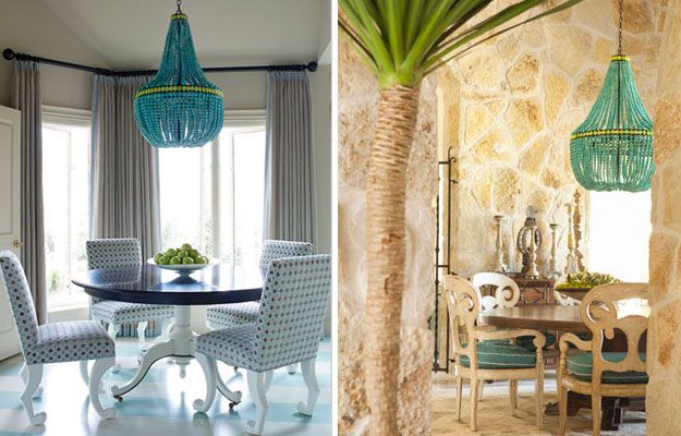
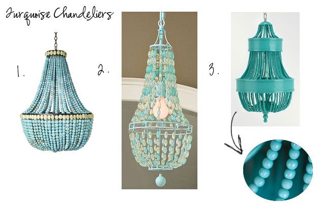
Turquoise, Pantone's color of the year, it making a statement in both residential and commercial spaces, but what I'm loving right now is this turquoise empire chandelier.


There is even a less expensive version at Pottery Barn Teen.  It's definitely cute enough to make a style statement in a teen's room, but not in a dining space.
1. Turquoise Empire Chandelier, Marjorie Skouras Design  2. Glass Bead Chandelier, Pottery Barn Teen 
3. Catalonia Small Chandelier, Shine by S.H.O

Lastly, here's a refreshing color palette using Sea Glass and two of the Pantone forecast colors, Tomato Puree and Dried Herb. Using Sea Glass in lieu of Turquoise escapes the retro look and arrives to one that is more meditative and calming.  Tomato Puree replaces classic red and Dried Herb is said to be "the ultimate green neutral pairing well with all other colors."


Do you find inspiration from the ocean and sea? How has the ocean found its way into your decor? What is your idea of Understated Elegance? Are you enjoying these posts as much as I am?

Spring 2010 - Coral, Black, White + Bubbles


Let me first start this week by welcoming my new readers joining me from Maria's blog.  I received so many positive comments and emails regarding last week's interview which says a lot about her following.   

I also want to send a special thank you to Lisa at Destination Seaborn for featuring BluLabel Bungalow this past Friday! After reading her post, it made me feel great to know that my vision for BluLabel Bungalow is being communicated clearly and that you love it! Please visit Lisa's blog, here.

Moving on...today, in the midst of another threat of snow, I am dreaming of Spring.  And what does Spring 2010 bring in terms of trends and colors in home decor? Based on the Pantone Fashion Color Report for Spring 2010, our wardrobes are expected to contain these colors:

As seen below, Tory Burch's Spring 2010 Collection features "fusion coral" and is inspired by resort wear with bold colors, graphic patterns, and textures.  Resort wear as it translated into home decor tends to teeter on the edge of whimscial and sophisticated as illustrated in these room designed by Lynn Morgan.  The introduction of coral against the stark contrast of bold black and white patterns breathes an element of playfulness.

 garments Tory Burch, rooms Lynn Morgan

Here is coral once again but this time paired with tan, another neutral. Warm neutral walls temper the room while still allowing coral to exist (floor to ceiling) as the dominate color. The watery blue centerpiece is reminiscent of seaglass found on the beach.  It makes me wonder if the designer found inspiration for this room while combing the beach.


Also check out my previous post here where I recently used coral and neutrals in my client's home office redesign.

Regarding home decor trends, the sunbrust mirror continues to maintain its momentum as well as the presence of animal print (timeless, if you ask me).  What I'm excited about is the sculptural-like quality of "Bubble-Inspired" Lighting.  Very contemporary, it still has a place in traditional home decor.  Eye-catching and lighthearted, it creates the illusion of bubbles floating through the air as well as enhancing the feeling of having an open space...proves that bubbly doesn't always come in a bottle.
 
1. floating bubble ceiling fixture, Possini 2. annika chandelier, Oly Studio 
3. bubble globe pendant chandelier, Robert Sonneman 4. bubble cascade table lamp, Possini

What other colors and trends do you see popping up in home decor for the Spring?
Blog Widget by LinkWithin