Quantcast
Showing posts with label color theory. Show all posts

WHAT COLOR IS SENSUALITY?


In a recent interview, I was asked why I chose to pursue a career in interior design. Simply put, I gain joy from creating an atmosphere that supports way the client wants to feel. 

Case in point, during a client consultation I asked a couple what kind of "mood" they wanted for their master bedroom. I threw out a few suggestions like restful, serene, relaxing just to encourage their thoughts. The husband's immediate response was "SEXUAL" (insert raised eyebrows here). The wife's answer made mention of a "love nest" or something. With all the eye exchange, I knew I needed to wrap things up before they tore into each other. But before I made my escape, I asked more specific questions about their color preferences. They both said they were open to any color just as long as it felt warm.

The psychology of interior design is intriguing because it engages all of our five senses and it has a way of affecting our moods without our awareness or permission.


But back to the client couple...In your opinion, what is a "sexual" paint color? What is sexy to me would probably be relaxing to someone else. What color is your bedroom?

SPECIAL GUEST: DECOR DEMON


Known for his fast paced ability to raid garage sales and flea markets for unique pieces with which he creates bold, beautiful, and bad ass spaces, Brian Patrick Flynn has earned the moniker Decor Demon. Currently, he is the associate producer, set decorator, and on-air talent for the TBS series Movie and a Makeover. He joins us today with a unapologetic discussion on experimenting with color.


OVER THE RAINBOW
A designer's quest to experiment with every color over the rainbow.

My friend Jennifer once overheard a TV style expert preach how red shoes were solely for children and whores. Naturally, she had me at whores. Although the aforementioned fashionista fancied all things NON-crimson, yours truly happens to crave the company of reds both fire-engine AND candy apple. My point---and I do have one---is that color is too personal to be deemed right or wrong.

I’m a self-taught designer and [a] should STFU, step aside and have an ASID scribe this post [b] have my lawyer scrutinize these words of mine before they go onto the Intranets; however, I’ve received genuine praise from my formally trained peers in regards to my experimentation with color. Well, maybe we’ll disregard the writer who “complimented” me on my “garish, wacky and loud” body of design work. NOTE TO WRITER: when complementing someone, perhaps try using COMPLEMENTARY adjectives. Anyhow, in my book unexpected color pairings are to design what multiple orgasms are to sex. Classics are always fantastic but some become so trendy that they just kinda suck it hard. Robin’s egg and milk chocolate bachelor pads? SNORE. Blood red dining room walls? Sure, if you’re serving up Cliche Casserole to children and whores. Ballet slipper pink and antique white girl’s nursery? Stabbing. Self. In. Eye. With. Pencil. How about a black, kelly green, white and cobalt lounge? Ding, ding ding! There are so many hues out there begging to be played with and it’s up to both you and I to color them happy.

ALL DRESSED UP
In this girl’s bedroom, Brian chose a shade of blue-green for the walls, weathered grey wood for the ceiling, charcoal drapery and bed fabrics with pops of tangerine.


BOYS CLUB
Brian designed this Jane Fonda-inspired room for the Oscar winner’s GCAPP charity auction. Geared towards male bidders, Brian bucked routine bachelor pad color schemes and instead opted for silvery grey-brown tones set against lavender walls.


COLOR ME HAPPY
When asked to design an infant boy’s playroom, Brian kept the walls white, then introduced pea green and dark brown on the ceiling and in accents.

GROUP THERAPY
This dining room made from mismatched chairs showcases Brian’s love of kelly green paired with black-brown, fire-engine red and ultra-white.


WELCOMING DRAMA
On Decor Demon, Brian transformed his own carport into a fun dining space pairing black-brown with marble grey, charcoal and red-orange.


DO YOUR HOMEWORK
To create the perfect shot in a boy’s room, Brian styled the overall blue space with lime green and red accents.

GRAPHIC CONTENT
Instead of the common pairing of powder blue with chocolate brown, Brian often persuades clients to try black paired with navy blue, silver and ultra white as seen here in this bachelor’s lounge.


FASHION STATEMENT
Brian is the associate producer AND on-air designer for the TBS series Movie & A Makeover. When asked to redesign the set for the show’s eight season, Brian brought in glamour with grey and silver tones paired with accents of violet and hot pink.

Visit Decor Demon for more of Brian's awesomeness...

Tastemaker Tuesday: Maria Killam, Colour Expert


I've been hooked on Maria's blog from the day I was introduced.  A wellspring of information, Maria has an artist's spirit and the heart of a teacher.  Her hugely popular blog discusses the ins and outs of color and does an amazing job of explaining color theory to her readers. Her informative and lighthearted posts have received well deserved mentions from the Washington Post Blog Watch five times with titles such as "The Right Way to Create Flow Using Colour" and "5 Questions to Consider When Selecting a New Colour for Your Kitchen." Each time I read one of her blog posts, I always leave with valuable design nuggets or a fresh prespective of the given subject matter. Maria's work and advice has also be featured in Alberta Home Magazine and BC Home Magazine.  So for everyone who is tackling design projects in the new year, I thought it would be the perfect time to introduce you to Maria Killam, a Canadian-born international colour designer, writer, editor, and colour theory instructor.  Thank you Maria for taking the time to give us this interview and for all of your assistance! Enjoy!- Erika


{Vancouver Color Queen, Maria Killam, on the cover of BC Home Magazine}


Erika Ward: Which colors inspire you the most?

Maria Killam: I love happy colours in any combination!

What 2010 design trend has you "rolling your eyes?"

Oversized flat screen televisions. They belong in Media Rooms, period.

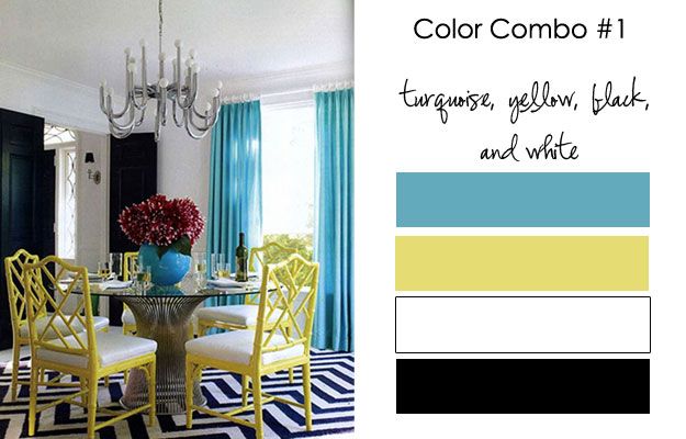
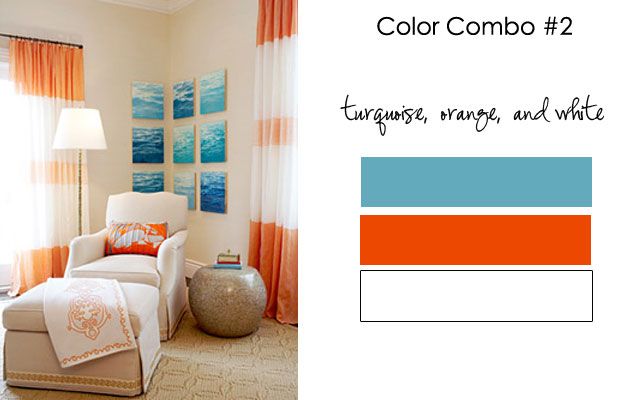
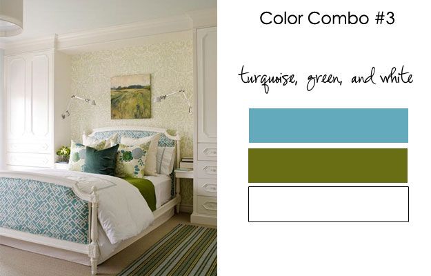
With turquoise as the Pantone Color of the Year, can you give us three color palettes that contain the color turquoise?

I love the sophisticated look of turquoise with black and white!  Here it is with the addition of yellow:


Turquoise, Orange, and White

 
Turquoise, Green, and White


The combinations I've chosen all have white in them. I think white belongs with turquoise because white just looks best with fresh happy colours!

Not only do you give great color advice, but also great advice about being a blogger. What makes you so passionate about helping fellow bloggers?

I'm generally obsessed with finding the "right" answer or the "right" way of doing something for any area of my life.  When I was in Corporate (before my designer days) I always felt like I was just "making it up as I went along" without any real direction from anyone.  For this reason I am quick to offer my knowledge to anyone looking for the same thing!


When reading other blogs, what is one of your pet peeves you see repeated time and time again?

Music.  Your favourite song is probably not mine, enough said.


Please name 5 of your favorite things (list WHATEVER comes to mind).


1. Flowers. Tulips for how sexy they are and the scent of Casablanca Lilies
2. I love my morning coffee.  I am a morning person.
3. Intelligent conversation
4. I love a good book and picnic at the beach
5. Having a great bag that looks good with everything

{designed and styled by Maria Killam}

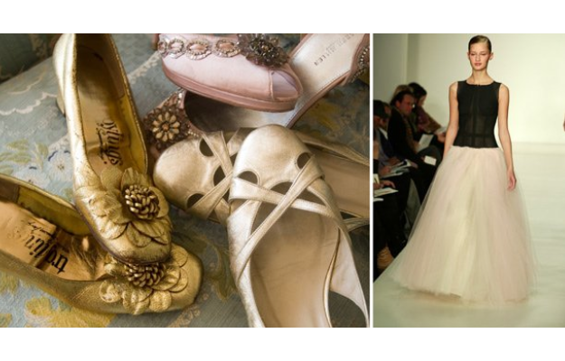
What do you think about fashion and it's influence on interior design?

I think colours in particular match up with interior design. For example, when burgundy was a trend in the 80's we wore burgundy. I have also noticed that people tend to dress to match their decor.
{image courtesy of Annette Tatum, The Well-Dressed Home}


It is 2015, what direction have you taken regarding your business?

I have a book, a retail location, and  I am an internationally known colour designer.


{Designed by Maria Killam}
Blog Widget by LinkWithin