Quantcast
Showing posts with label fall 2009 color forecast. Show all posts

Fashion Friday: The Runway Palette by Cargo Cosmetics


Today's Fashion Friday post is really geared more towards makeup and beauty. The jumping off point...The Runway Palette by Cargo Cosmetics. Talk about adorable! This limited edition palette, available exclusively at Sephora, takes the guesswork out of applying Fall 2009's hottest runway looks. How clever are the button-embossed eye shadows and the "cable knitted" bronzer and blushes? The center palette is what Cargo calls the "Essential Palette in Gray." What are the runway makeup trends for Fall 2009? Try smoky gray eyes (using the essential palette), bronzed cheeks, nude lips, and pops of jeweled toned colors on the eyes...exciting enough to make you find somewhere to go. And my favorite look for all seasons, a full well-manicured brow.

The smoky eye can be a bit tricky and requires a bit of practice. I'm planning an honest attempt at this for my event Saturday night! A wrong move and I could be donning the raccoon look or even worst look as if I lost a boxing match. I'm planning to follow the instructions below. The first is an easy-peasy tutorial straight from the Cargo Cosmetics website. The other is a video I found on the New York Magazine site. Wish me luck and HAVE A GREAT WEEKEND. Ciao!
Watch the video below to learn how to recreate the smoky eye look at home.

Fall 2009 BLB Color & Trend Forecast #6 - Mid-Century Modern


Happy Friday and welcome to the final segment of BLB's Color and Trend Forecast. I hope you have enjoyed this series as much I have writing it. In case you missed any segment of the series, click the titles below to view previous post.

#1 - HD Elegance
#2 - Exotic Destinations
#3 - Anime Luxe
#4 - Stylish Sustainability
#5 - Hollywood Regency

#6 - Mid-Century Modern, is reminiscent of the Post War 1950's era when designers were optimistic about the future and looked for ways to establish harmony between natural and man made design elements. Furnishings tend to be well-built, have clean lines, and have smaller scale, perfect for apartments or small spaces. For design inspiration closer to home, look perhaps toward your grandmother's house! She may still have a few pieces in rotation or there may be a few in the attic. If this isn't quite your style, make some extra cash by selling it on craiglist or ebay! And for the mood board...be inspired!

{#1} Nelson Ball Clock, Design Within Reach {#2} Cordova Lamp-Bungalow 5, Tonic Home
{#3} Imperial Trellis in Citrine, Schumacher {#4} Jacques Adnet Floor Lamp, 1stdibs.com, {#5} Edward Wormley sofa, 1stdibs.com, {#6} Pair of Dunbar Y-back Chairs, 1stdibs.com, {#7} Harvey Probber Gentlemans Chest, 1stdibs.com, {#8} Aurora Tangerine Modern Area Rug, Tonic Home, {#9} Harvey Probber coffee table, 1stdibs.com

The "shagadelic" poster below entitled "Mid-Century Modern Collection" by technical illustrator James Provost displays classic chairs by iconic designers such as Eames, Noguchi, Bertoia, Le Corbusier, and Knoll. This "16x24" print is only $21 at Imagekind.

Recognize any of these iconic chair designs?

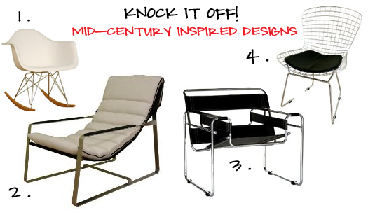
Purchasing original mid-century pieces can surely bust a design budget if not inherited or found at a thrift store. There are a plethora of furniture retailers offering designer knockoffs and other mid-century inspired pieces that will suit just fine. The four chairs below all come from Target and carry wallet-friendly price tags. {#1} Vignette Cradle Chair {#2} Charlie Chair {#3} Leisure Chair with Arms {#4} Thosa Steel Chair
Other Retailers for Mid-Century Furniture, Fabric, & Accessories:
Design Within Reach
Target
Tonic Living
Tonic Home
Ikea
1stDibs.com (for antiques and original designs)

Moving on to the exterior of your home...if you have a 1950's inspired bungalow and are looking to take mid-century influences to the exterior of your home, then look no further than this brochure from Sherwin Williams. Suburban Modern (below) is composed of suggested color palettes and makes choosing house colors foolproof! Click image for brochure in pdf.


Jonesing for more mid-century design? Snag a copy of Atomic Ranch Magazine or check out one of these blogs: Mid-Century Modernist or Lushpad.

What is your favorite color/and or design trend of the series? Looking forward to your thoughts, let's chat!

Fall 2009 BLB Color & Trend Forecast #5 - Hollywood Regency


Fall 2009 BLB Color and Trend Forecast #5 is Hollywood Regency. This style is one of my favorites simply because of its worldly influences. You will find Moroccan, Asian, and European influences in furnishing and accessories coexisting harmoniously in one space. It's romantic, graceful, nostalgic, and archival. I purposely chose not to feature a color palette for this style for I am in awe of its bold colors and mix of old and new to create an updated look that is unapologetically fresh and contemporary. Let's take a look...below are examples of design characteristics found in the Hollywood Regency style and their corresponding names.

When shopping for items for a Hollywood Regency-inspired space, take this handy cheat sheet along with you to help you stay focused. This list is not all-encompassing, just a little something to get your started on your way!

Hollywood Regency has been respectfully updated by well respected designers such as Kelly Wearstler and Jonathan Adler. I leave you with some design eye-candy from Wearstler that will hopefully leave you inspired while on your quest to bring Hollywood glitz and glamour into your home. Ciao!


{images courtesy of Viceroy Santa Monica hotel designed by
Kelly Wearstler}

Fall 2009 BLB Color & Trend Forecast #4 - Stylish Sustainablilty


Reconstruction, regeneration, sustainability, and (eco) responsibility are buzzwords that inspired BluLabel's Color and Trend Forecast #4 - Stylish Sustainability. Though BLB has named Stylish Sustainability as trend, the hope is that practices are not temporal, but become incorporated into your decorating process. The rising popularity of consumer eco-sensitivity has given rise to a wider and more beautiful range of home decor products from low VOC paints to fabrics made from organic cotton.

The chosen palette for Stylish Sustainabilty is organic in nature and celebrates resourcefulness and inventive integrity. Bark, speaks of the earth and fertile soil, while Strawberry Ice and Wasabi symbolizes a fruitful and flavorful harvest. Combining this palette with exisiting neutrals found in your space attests that style and sustainablity can and do coexist.
Inhabit, an eco-fabulous decor brand, develops products that are inspired by nature and a genuine love for our planet. Their 3-D wall flats {#1} & {#5} were named the Eco-Friendly Product of the Year by Interior Design Magazine. This three dimentional wall covering is made of 100% bamboo pulp, 100% biodegradable, and can be painted to suit your decor. {#3} Rhythm in Sky pillow with its sky blue and chocolate modern, graphic pattern is also by Inhabit. The pillow is hand-printed in the USA using environmentally-friendly inks and the fabric is made from recycled materials! {#2} Artichoke Lamp is handmade of papier mache by artisans in Haiti and can be found at Stray Dog Designs. It comes with a hefty price tag, but can be color-customized with low VOC paint as shown above in Douglas Fir. {#4} Builtby Lamp in Mack Daddy/Green and Walnut by Inhabit does not disappoint with it's sleek modern design that is also customizable. In fact, their website estimates 1,607,045 possible color combos can be achieved. Because this many choices can overwhelm even the savviest comsumer, they offer fantastic in-house design options as well. In regard to fabrics, there is no shortage of fashionable, earth-friendly options as seen here in {#6} Glacier Fret by Schumacher. Made from 100% organic cotton, this crisp, contemporary fabric would look fantastic on an upholstered bench or made into accent pillows. Glacier Fret carries Schumacher's Environmentally Sustainable mention.

In addition to new available products, don't forget to browse thrift stores, yard sales, and antique malls for fabulous finds that could otherwise end up in landfills. Look out for upcoming posts on how to REFURBISH, REPAINT, and REUPHOLSTER! Be back tomorrow, ciao!

Fall 2009 BLB Color & Trend Forecast #3 - Anime Luxe


"I owe my color sense to crayons." - Angelo Rafael Donghia

BluLabel Bungalow continues this week with the Fall 2009 Color and Trend Forecast with #3 Anime Lux. If you happened to miss #2 - Exotic Destinations (click here), and #1 - HD Elegance (click here).

Anime is an abbreviated pronunciation in Japanese of "animation," but the world outside of Japan refers to anime as Japanese comics. Visual stylizations in anime typically consist of characters with exaggerated features and facial expressions and are often illustrated in bold colors. The widespread popularity of digitized anime is the design influence of today's trend I like to call "Anime Luxe."

Accessorize your space using colors in this fun-loving palette which proves to be upbeat and vibrant. If you're looking to liven up your space with bold color without it appearing juvenile, reupholster your accent chairs with this beautiful "pop fabric" Metro by Alexander Henry {#5}. To further the design without being too theme-y use a dark wood frame to display a large piece of Uzu Kanji fabric also by Alexander Henry {#7} as instant artwork! Illuminate your space with this modern daisy-shaped Margarita Lamp by Miguel Herranz {#4} made from natural wood veneer and comes in numerous colors. For a table lamp that makes a statement, opt for the Tube Top Color Lamp by Pablo {#1}. Its sophisticated, acrylic base comes in 6 colors...gotta love options! Wanna splurge? Anthropologie's Antwerp Chair in Bloom {#2} has a gorgeous, feminine shape and the upholstery fabric isn't too shabby either! Serving your guest a beverage in one of these tumblers {#3, source unknown}. The festive design will carry the lively theme of any party. This high-gloss green lacquer table {#7} from cb2.com will certainly be a conversation piece at any gathering. It's always a good idea to take risks with small scale furniture in gutsy colors before making a commitment with a larger scaled item.

On the fashion tip, here's an example how anime has influenced the fashion world. Takashi Murakami, a Japanese illustrator, created the canvas for Louis Vuitton's Multicolor Palette heavily based on anime. Check out the Matsuya Department Store in Ginza (below) decked out in LV's colorful , iconic logo!


Murakami has recently produced an anime short entitled Superflat First Love that celebrates their six years of collaboration. Check out the video below.


Fall 2009 BLB Color & Trend Forecast #2 - Exotic Destinations


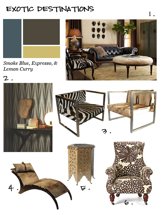
BLB Color & Trend Forecast #2 - Exotic Destinations emphasized the uniqueness of the region, rich, organic hues, and has a "style without borders" attitude. Identifying your ancestral roots and incorporating them into our home environment establishes a connection with your predecessors and instills a sense of reverence and pride in your respective culture. Exotic Destinations also celebrates exploration and shows an appreciation for the global environment.When incorporating Exotic Destinations in your design plan consider alternative neutrals in your color scheme such as smoke blue, expresso, and lemon curry. These colors have a richer appearance even will preserve a high end look even if you paid discount prices. Look for pieces made of exotic woods and fabrics that are highly textured. If animal skins (or hair) are not your forte, opt for a British Colonial style. Take for example the Astrid chair from Anthropologie. Though it is not a true British Colonial piece, it's cocoa-hued dahlia pattern and mahogany turned legs evokes the world traveler spirit of Ernest Hemingway...it almost makes you crave a mojito.

{image credits: (1.)Horchow (2)wallpaper: Zebra, Papers Five Collection by Neisha Crosland (3 & 4)game skin chairs by Van Heerden Design (5)Moroccan-style garden seat by Horchow (6) chair: Astrid in Naive Chocoloate, Anthropologie}

Fall 2009 BLB Color & Trend Forecast #1 - HD Elegance


The first BluLabel Bungalow color and trend forecast is HD (High Definition) Elegance. This palette, without a doubt, is strongly influenced by technology and our desire as consumers to have greater quality in regards to resolution, pixelation, and sound.
HD Elegance has a color basis of iron, steel gray, and black...I like to think of it as an homage to the classic black and white television set. The pillows provide visual interest with its bold gold color and shiny silver texture. The black pillow with its cobalt blue damask pattern introduces a contemporary classic element...a perfect example of how two distinctly different styles can co-exist. The graphic and geometric silhouettes as seen in the bedding and wallpaper satisfies our need for optical illusions. When attempting to decorate your space in HD Elegance try using an urban loft as design inspiration.

{image credits: pillows and bedding: Modern Bliss Home,
geometric wallpaper: Viva-Black Gloss by Barbara Hulanicki}

Part I - Fall 2009 Color Forecast & Decor Series


Today kicks off Part 1 of BLB's Fall 2009 Color Forecast & Decor Series. Expect this three part series to be educational as well as inspirational. You will learn how the industry forecasts new color trends, get the deets on the Pantone Institute's Fall 2009 Fashion Color Trends, and receive BluLabel Bungalow's color and home decor forecast for the upcoming season (I hope you're still reading). Without further delay...

How Does the Industry Forecast New Color Trends?
Color forecasters start as early as the previous year in predicting colors and trends for the next year. They observe changes in nature, social issues, the economy, technology, lifestyles, and the needs, moods, fantasies, and aspirations of consumers. The research is then "translated" into colors and palettes that are utilitzed by fashion designers, interior designers, graphic designers, advertisers, etc.

On the Fashion Tip...
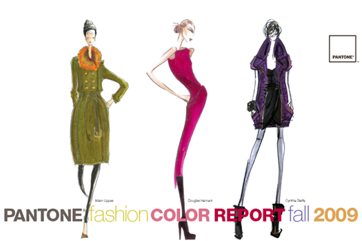
Though you may still be immersed in your summer wardrobe, it's time to consider what's ahead for Fall and Winter. The Pantone Institute released it's top 10 colors for fall back in February 2009. According to Leatrice Eisemen, Executive Director of the Pantone Institute, "The fall 2009 palette is more unique and thoughtful than the typical autumnal hues of years past." She also says designers recognize the desire for fundamental basics that speak to current economic conditions, but also understand the need to incorporate vibrant color to grab the consumers' eyes and entice them to buy.
I find it interesting how the chosen colors supposedly support recessionary living. The idea is based on the fact that the palette is void of bold statement colors that tend to be more "trendy" and age quickly. We, in turn, as consumers should get more wear out of our new fall garments.
As a bonus, the Pantone report contains color advice for consumers who want to stay fashionable on a budget from well known fashion insiders such as Tim Gunn, Nina Garcia, and Clinton Kelly.

Don't fret if you missed its inital release, I've got you covered. Click here for a free copy of the report.

On the Decorating Tip...
Tomorrow, look forward to whetting your appetite for design with sumptuous fabrics, timeless furnishings, and innovative color palettes when I return with Part 2 of the BLB Fall 2009 Color Forecast & Decor Series. Ciao!
Blog Widget by LinkWithin