Quantcast
Showing posts with label pantone. Show all posts

COLOR NEWS: PANTONE SELECTS "TANGERINE TANGO" AS THE COLOR FOR 2012


Yesterday Pantone Color Institute, a.k.a. the world's color authority in fashion and home, crowned "Tangerine Tango" as 2012's Color of the Year.


So what does this mean for us? We can expect to find an abundance of this zesty reddish orange in the upcoming Spring and Fall Fashion Collections as well as in cosmetics, paints, home decor fabrics, and accessories. Pantone Color Institute's executive director, Leatrice Eiseman reports,

"Sophisticated but at the same time dramatic and seductive, Tangerine Tango is an orange with a lot of depth to it...Reminiscent of the radiant shadings of a sunset, Tangerine Tango marries the vivaciousness and adrenaline rush of red with the friendliness and warmth of yellow, to form a high-visibility, magnetic hue that emanates heat and energy."  


via m design interiors
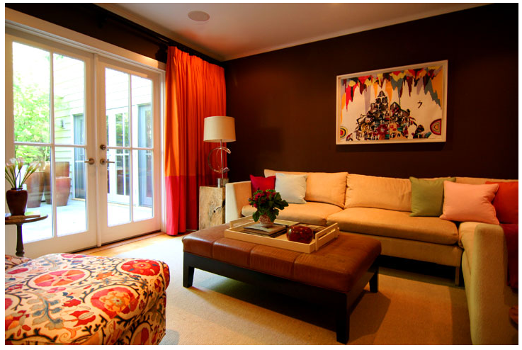
Tangerine is one of those colors that looks great with almost everything, doesn't it. Above, the duotoned drapery makes a great impact against rich, chocolate brown walls. They, combined with the artwork and patterned ottoman, are what takes this room from good to great.

At the moment, I'm smitten with the combination of tangerine and fuchsia:

I could start with using them as pillow accents...
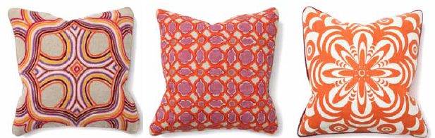
pillows by Villa Home Collection

...and use them against a neutral backdrop as seen in this bedroom designed by Janice Palmer. She created this showstopping suite in the Atlanta Symphony Associates Decorators' Show House and Gardens last May. Click here to see the rest of the space and my exclusive interview with her.


I can't mention the new color without listing the previous selections from the past years. Many of the trends are still going strong, especially turquoise.

PANTONE 19-2120 Honeysuckle (2011)
PANTONE 15-5519 Turquoise (2010)
PANTONE 14-0848 Mimosa (2009)
PANTONE 18-3943 Blue Iris (2008)
PANTONE 19-1557 Chili Pepper (2007)
PANTONE 13-1106 Sand Dollar (2006)
PANTONE 15-5217 Blue Turquoise (2005)
PANTONE 17-1456 Tigerlily (2004)
PANTONE 14-4811 Aqua Sky (2003)
PANTONE 19-1664 True Red (2002)
PANTONE 17-2031 Fuchsia Rose (2001)
PANTONE 15-4020 Cerulean (2000)

Does tangerine already exist in your home and wardrobe? If not, how will you use tangerine in the upcoming year?

Part I - Fall 2009 Color Forecast & Decor Series


Today kicks off Part 1 of BLB's Fall 2009 Color Forecast & Decor Series. Expect this three part series to be educational as well as inspirational. You will learn how the industry forecasts new color trends, get the deets on the Pantone Institute's Fall 2009 Fashion Color Trends, and receive BluLabel Bungalow's color and home decor forecast for the upcoming season (I hope you're still reading). Without further delay...

How Does the Industry Forecast New Color Trends?
Color forecasters start as early as the previous year in predicting colors and trends for the next year. They observe changes in nature, social issues, the economy, technology, lifestyles, and the needs, moods, fantasies, and aspirations of consumers. The research is then "translated" into colors and palettes that are utilitzed by fashion designers, interior designers, graphic designers, advertisers, etc.

On the Fashion Tip...
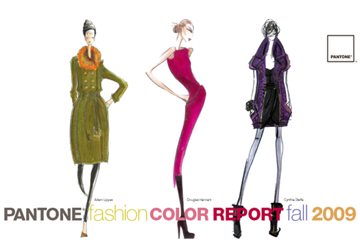
Though you may still be immersed in your summer wardrobe, it's time to consider what's ahead for Fall and Winter. The Pantone Institute released it's top 10 colors for fall back in February 2009. According to Leatrice Eisemen, Executive Director of the Pantone Institute, "The fall 2009 palette is more unique and thoughtful than the typical autumnal hues of years past." She also says designers recognize the desire for fundamental basics that speak to current economic conditions, but also understand the need to incorporate vibrant color to grab the consumers' eyes and entice them to buy.
I find it interesting how the chosen colors supposedly support recessionary living. The idea is based on the fact that the palette is void of bold statement colors that tend to be more "trendy" and age quickly. We, in turn, as consumers should get more wear out of our new fall garments.
As a bonus, the Pantone report contains color advice for consumers who want to stay fashionable on a budget from well known fashion insiders such as Tim Gunn, Nina Garcia, and Clinton Kelly.

Don't fret if you missed its inital release, I've got you covered. Click here for a free copy of the report.

On the Decorating Tip...
Tomorrow, look forward to whetting your appetite for design with sumptuous fabrics, timeless furnishings, and innovative color palettes when I return with Part 2 of the BLB Fall 2009 Color Forecast & Decor Series. Ciao!
Blog Widget by LinkWithin