Quantcast

Brake for Beauty: Essie's New Fall Collection


With autumn creeping up on us, though you wouldn't know it here in HotLanta, there is still time to show off a mani/pedi in one of Essie's new fall collection colors. With names like Chinchilly, Pink Parka, and Mink Muffs, I feel the cool, crisp autumn breeze already.Looking at the new palette, I am instantly drawn to the color combination of Chinchilly, Midnight Cami, and Pink Parka. Not for my nails, but for a luxurious bedroom suite design...any takers?

Since now we're on the subject of decor (surprise, surprise) I must invite you to view the interior of my favorite nail salon, Polished Beauty Lounge in Smyrna where the decor brightens the dreariest of days. Flocked fuschia wallpaper covers the wall in the waiting/lounge area and the manicure stations have the most lovely lucite-legged chairs. The seats don a teal and fuschia botanical print that is soft, feminine, and sophisticated. The glossy white floors and pristine, white ceramic sinks shout modern elegance and of course cleanliness!

I should also mention you can reserve the space for spa parties (which they do quite frequently) so call ahead to schedule an appointment...I had to learn the hard way! Anyway, check them out and tell me about your experience!

Custom Wall Art Using Paint Pens


"Good taste and design are by no means dependent upon money"
-David Hicks

Amen, David Hicks! I couldn't agree more with this week's design quote. After reviewing my design plan for our home and then reviewing my actual design budget, I've co
me to the conclusion that I will be performing more DIY projects than I originally anticipated...especially in the kids rooms.

I previously saved this image, a super cute wall decal for my daughter Ava's room, back in December of last year. At the time it was sold out at DaliDecals shop at Etsy, but I had high hopes of it returning in the spring.

Well here we are almost a year later and it's still out of stock! I don't accept defeat (especially in the area of design) and immediately began looking for a replacement until I found this.

Kellie of Every Jot and Tittle shop, also at Etsy, used two fat gold paint pens to draw this wallpaper pattern. Her inspiration for the pattern? An old Fossil catalog. You know where I'm going with this, right? Why can't I use the same process to recreate the Swirling Poppy wall design for Ava's room? This is even better because she, nor her knucklehead brothers, would be able to peel off a painted design like they could a wall decal! I just need to make sure they aren't around to watch me draw on the wall. The cost, under $10! **Cha-ching** Nothing turns me on like saving design dollars!

Read Kellie’s story at her blog and buy what you need here or at your local art supply. I can't wait to get started! Your thoughts?

Fall 2009 BLB Color & Trend Forecast #6 - Mid-Century Modern


Happy Friday and welcome to the final segment of BLB's Color and Trend Forecast. I hope you have enjoyed this series as much I have writing it. In case you missed any segment of the series, click the titles below to view previous post.

#1 - HD Elegance
#2 - Exotic Destinations
#3 - Anime Luxe
#4 - Stylish Sustainability
#5 - Hollywood Regency

#6 - Mid-Century Modern, is reminiscent of the Post War 1950's era when designers were optimistic about the future and looked for ways to establish harmony between natural and man made design elements. Furnishings tend to be well-built, have clean lines, and have smaller scale, perfect for apartments or small spaces. For design inspiration closer to home, look perhaps toward your grandmother's house! She may still have a few pieces in rotation or there may be a few in the attic. If this isn't quite your style, make some extra cash by selling it on craiglist or ebay! And for the mood board...be inspired!

{#1} Nelson Ball Clock, Design Within Reach {#2} Cordova Lamp-Bungalow 5, Tonic Home
{#3} Imperial Trellis in Citrine, Schumacher {#4} Jacques Adnet Floor Lamp, 1stdibs.com, {#5} Edward Wormley sofa, 1stdibs.com, {#6} Pair of Dunbar Y-back Chairs, 1stdibs.com, {#7} Harvey Probber Gentlemans Chest, 1stdibs.com, {#8} Aurora Tangerine Modern Area Rug, Tonic Home, {#9} Harvey Probber coffee table, 1stdibs.com

The "shagadelic" poster below entitled "Mid-Century Modern Collection" by technical illustrator James Provost displays classic chairs by iconic designers such as Eames, Noguchi, Bertoia, Le Corbusier, and Knoll. This "16x24" print is only $21 at Imagekind.

Recognize any of these iconic chair designs?

Purchasing original mid-century pieces can surely bust a design budget if not inherited or found at a thrift store. There are a plethora of furniture retailers offering designer knockoffs and other mid-century inspired pieces that will suit just fine. The four chairs below all come from Target and carry wallet-friendly price tags. {#1} Vignette Cradle Chair {#2} Charlie Chair {#3} Leisure Chair with Arms {#4} Thosa Steel Chair
Other Retailers for Mid-Century Furniture, Fabric, & Accessories:
Design Within Reach
Target
Tonic Living
Tonic Home
Ikea
1stDibs.com (for antiques and original designs)

Moving on to the exterior of your home...if you have a 1950's inspired bungalow and are looking to take mid-century influences to the exterior of your home, then look no further than this brochure from Sherwin Williams. Suburban Modern (below) is composed of suggested color palettes and makes choosing house colors foolproof! Click image for brochure in pdf.


Jonesing for more mid-century design? Snag a copy of Atomic Ranch Magazine or check out one of these blogs: Mid-Century Modernist or Lushpad.

What is your favorite color/and or design trend of the series? Looking forward to your thoughts, let's chat!

Fall 2009 BLB Color & Trend Forecast #5 - Hollywood Regency


Fall 2009 BLB Color and Trend Forecast #5 is Hollywood Regency. This style is one of my favorites simply because of its worldly influences. You will find Moroccan, Asian, and European influences in furnishing and accessories coexisting harmoniously in one space. It's romantic, graceful, nostalgic, and archival. I purposely chose not to feature a color palette for this style for I am in awe of its bold colors and mix of old and new to create an updated look that is unapologetically fresh and contemporary. Let's take a look...below are examples of design characteristics found in the Hollywood Regency style and their corresponding names.

When shopping for items for a Hollywood Regency-inspired space, take this handy cheat sheet along with you to help you stay focused. This list is not all-encompassing, just a little something to get your started on your way!

Hollywood Regency has been respectfully updated by well respected designers such as Kelly Wearstler and Jonathan Adler. I leave you with some design eye-candy from Wearstler that will hopefully leave you inspired while on your quest to bring Hollywood glitz and glamour into your home. Ciao!


{images courtesy of Viceroy Santa Monica hotel designed by
Kelly Wearstler}

Fall 2009 BLB Color & Trend Forecast #4 - Stylish Sustainablilty


Reconstruction, regeneration, sustainability, and (eco) responsibility are buzzwords that inspired BluLabel's Color and Trend Forecast #4 - Stylish Sustainability. Though BLB has named Stylish Sustainability as trend, the hope is that practices are not temporal, but become incorporated into your decorating process. The rising popularity of consumer eco-sensitivity has given rise to a wider and more beautiful range of home decor products from low VOC paints to fabrics made from organic cotton.

The chosen palette for Stylish Sustainabilty is organic in nature and celebrates resourcefulness and inventive integrity. Bark, speaks of the earth and fertile soil, while Strawberry Ice and Wasabi symbolizes a fruitful and flavorful harvest. Combining this palette with exisiting neutrals found in your space attests that style and sustainablity can and do coexist.
Inhabit, an eco-fabulous decor brand, develops products that are inspired by nature and a genuine love for our planet. Their 3-D wall flats {#1} & {#5} were named the Eco-Friendly Product of the Year by Interior Design Magazine. This three dimentional wall covering is made of 100% bamboo pulp, 100% biodegradable, and can be painted to suit your decor. {#3} Rhythm in Sky pillow with its sky blue and chocolate modern, graphic pattern is also by Inhabit. The pillow is hand-printed in the USA using environmentally-friendly inks and the fabric is made from recycled materials! {#2} Artichoke Lamp is handmade of papier mache by artisans in Haiti and can be found at Stray Dog Designs. It comes with a hefty price tag, but can be color-customized with low VOC paint as shown above in Douglas Fir. {#4} Builtby Lamp in Mack Daddy/Green and Walnut by Inhabit does not disappoint with it's sleek modern design that is also customizable. In fact, their website estimates 1,607,045 possible color combos can be achieved. Because this many choices can overwhelm even the savviest comsumer, they offer fantastic in-house design options as well. In regard to fabrics, there is no shortage of fashionable, earth-friendly options as seen here in {#6} Glacier Fret by Schumacher. Made from 100% organic cotton, this crisp, contemporary fabric would look fantastic on an upholstered bench or made into accent pillows. Glacier Fret carries Schumacher's Environmentally Sustainable mention.

In addition to new available products, don't forget to browse thrift stores, yard sales, and antique malls for fabulous finds that could otherwise end up in landfills. Look out for upcoming posts on how to REFURBISH, REPAINT, and REUPHOLSTER! Be back tomorrow, ciao!

Fall 2009 BLB Color & Trend Forecast #3 - Anime Luxe


"I owe my color sense to crayons." - Angelo Rafael Donghia

BluLabel Bungalow continues this week with the Fall 2009 Color and Trend Forecast with #3 Anime Lux. If you happened to miss #2 - Exotic Destinations (click here), and #1 - HD Elegance (click here).

Anime is an abbreviated pronunciation in Japanese of "animation," but the world outside of Japan refers to anime as Japanese comics. Visual stylizations in anime typically consist of characters with exaggerated features and facial expressions and are often illustrated in bold colors. The widespread popularity of digitized anime is the design influence of today's trend I like to call "Anime Luxe."

Accessorize your space using colors in this fun-loving palette which proves to be upbeat and vibrant. If you're looking to liven up your space with bold color without it appearing juvenile, reupholster your accent chairs with this beautiful "pop fabric" Metro by Alexander Henry {#5}. To further the design without being too theme-y use a dark wood frame to display a large piece of Uzu Kanji fabric also by Alexander Henry {#7} as instant artwork! Illuminate your space with this modern daisy-shaped Margarita Lamp by Miguel Herranz {#4} made from natural wood veneer and comes in numerous colors. For a table lamp that makes a statement, opt for the Tube Top Color Lamp by Pablo {#1}. Its sophisticated, acrylic base comes in 6 colors...gotta love options! Wanna splurge? Anthropologie's Antwerp Chair in Bloom {#2} has a gorgeous, feminine shape and the upholstery fabric isn't too shabby either! Serving your guest a beverage in one of these tumblers {#3, source unknown}. The festive design will carry the lively theme of any party. This high-gloss green lacquer table {#7} from cb2.com will certainly be a conversation piece at any gathering. It's always a good idea to take risks with small scale furniture in gutsy colors before making a commitment with a larger scaled item.

On the fashion tip, here's an example how anime has influenced the fashion world. Takashi Murakami, a Japanese illustrator, created the canvas for Louis Vuitton's Multicolor Palette heavily based on anime. Check out the Matsuya Department Store in Ginza (below) decked out in LV's colorful , iconic logo!


Murakami has recently produced an anime short entitled Superflat First Love that celebrates their six years of collaboration. Check out the video below.


Fall 2009 BLB Color & Trend Forecast #2 - Exotic Destinations


BLB Color & Trend Forecast #2 - Exotic Destinations emphasized the uniqueness of the region, rich, organic hues, and has a "style without borders" attitude. Identifying your ancestral roots and incorporating them into our home environment establishes a connection with your predecessors and instills a sense of reverence and pride in your respective culture. Exotic Destinations also celebrates exploration and shows an appreciation for the global environment.When incorporating Exotic Destinations in your design plan consider alternative neutrals in your color scheme such as smoke blue, expresso, and lemon curry. These colors have a richer appearance even will preserve a high end look even if you paid discount prices. Look for pieces made of exotic woods and fabrics that are highly textured. If animal skins (or hair) are not your forte, opt for a British Colonial style. Take for example the Astrid chair from Anthropologie. Though it is not a true British Colonial piece, it's cocoa-hued dahlia pattern and mahogany turned legs evokes the world traveler spirit of Ernest Hemingway...it almost makes you crave a mojito.

{image credits: (1.)Horchow (2)wallpaper: Zebra, Papers Five Collection by Neisha Crosland (3 & 4)game skin chairs by Van Heerden Design (5)Moroccan-style garden seat by Horchow (6) chair: Astrid in Naive Chocoloate, Anthropologie}

Fall 2009 BLB Color & Trend Forecast #1 - HD Elegance


The first BluLabel Bungalow color and trend forecast is HD (High Definition) Elegance. This palette, without a doubt, is strongly influenced by technology and our desire as consumers to have greater quality in regards to resolution, pixelation, and sound.
HD Elegance has a color basis of iron, steel gray, and black...I like to think of it as an homage to the classic black and white television set. The pillows provide visual interest with its bold gold color and shiny silver texture. The black pillow with its cobalt blue damask pattern introduces a contemporary classic element...a perfect example of how two distinctly different styles can co-exist. The graphic and geometric silhouettes as seen in the bedding and wallpaper satisfies our need for optical illusions. When attempting to decorate your space in HD Elegance try using an urban loft as design inspiration.

{image credits: pillows and bedding: Modern Bliss Home,
geometric wallpaper: Viva-Black Gloss by Barbara Hulanicki}

Part I - Fall 2009 Color Forecast & Decor Series


Today kicks off Part 1 of BLB's Fall 2009 Color Forecast & Decor Series. Expect this three part series to be educational as well as inspirational. You will learn how the industry forecasts new color trends, get the deets on the Pantone Institute's Fall 2009 Fashion Color Trends, and receive BluLabel Bungalow's color and home decor forecast for the upcoming season (I hope you're still reading). Without further delay...

How Does the Industry Forecast New Color Trends?
Color forecasters start as early as the previous year in predicting colors and trends for the next year. They observe changes in nature, social issues, the economy, technology, lifestyles, and the needs, moods, fantasies, and aspirations of consumers. The research is then "translated" into colors and palettes that are utilitzed by fashion designers, interior designers, graphic designers, advertisers, etc.

On the Fashion Tip...
Though you may still be immersed in your summer wardrobe, it's time to consider what's ahead for Fall and Winter. The Pantone Institute released it's top 10 colors for fall back in February 2009. According to Leatrice Eisemen, Executive Director of the Pantone Institute, "The fall 2009 palette is more unique and thoughtful than the typical autumnal hues of years past." She also says designers recognize the desire for fundamental basics that speak to current economic conditions, but also understand the need to incorporate vibrant color to grab the consumers' eyes and entice them to buy.
I find it interesting how the chosen colors supposedly support recessionary living. The idea is based on the fact that the palette is void of bold statement colors that tend to be more "trendy" and age quickly. We, in turn, as consumers should get more wear out of our new fall garments.
As a bonus, the Pantone report contains color advice for consumers who want to stay fashionable on a budget from well known fashion insiders such as Tim Gunn, Nina Garcia, and Clinton Kelly.

Don't fret if you missed its inital release, I've got you covered. Click here for a free copy of the report.

On the Decorating Tip...
Tomorrow, look forward to whetting your appetite for design with sumptuous fabrics, timeless furnishings, and innovative color palettes when I return with Part 2 of the BLB Fall 2009 Color Forecast & Decor Series. Ciao!

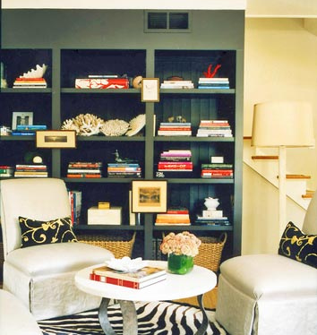
7 Steps to Styling Your Bookcase Like a Pro


Have you ever become frustrated with styling your bookcase? You've cleared the shelves, reorganized books, knick-knacks, candles, picture frames and it's still too sparse, too cluttered, or just too doggone tacky! Well here are a few tips that should help make the process much easier! Let's get started...

{bookcase styled by Lili Diallo}

Step 1 - Start with a Blank Canvas
Remove everything from the shelves and while you're at it dust the shelves and the books. Be honest with yourself, there's no telling when you'll get around to doing it again.

Step 2 - Edit Your Selection
Donate the books you will never read again and store those well worn/read paperbacks. Try stashing them in one of the storage solutions mentioned here. Remove the jackets from your hardback books. Removing the covers instantly reveals a clean and sometimes colorful book. Store the covers elsewhere.

Step 3 - Sort Books by Size and Subject

Step 4 - Place Books on Shelves
Instead of placing all of the books vertically, create a few horizontal stacks to add visual interest. Note that taller books often look better horizontally.

Step 5 - Fill Unused Space
If you have extra space add colorful storage boxes, small-scaled sculptures, vases, or framed photos to break the monotony of books.

Step 6 - Step Back and Reevaluate
Does the bookcase look too heavy on one side? Do you have too many books on the shelf? Always leave each shelf with about 10-15% open space. If you find that you have over accessorized remember this piece of advice from Coco Chanel, "When accessorizing, always take off the last thing you put on." This rings true not just in fashion, but also in decorating!

Step 7 - Admire Your Handiwork
You will probably continue to edit and rework a few pieces here and there until you are totally comfortable. You've completed this task quicker than expected, right?
**Extra Credit** Now that you have a little time on your hands consider wrapping a few books in colorful wrapping paper for added panache!

{image courtesy of Domino Magazine}

Send me pictures. I'd love to see what you've done!

Design Quote of the Week


"Good taste and design are by no means dependent upon money."
-David Hicks

This weekend I began working on a decorating plan for our new home. The plan consists of many items that currently are not in the budget, but it actually makes me even more determined to obtain the same look for less. There are numerous sites that offer excellent tutorials on sewing pinch-pleated curtains as seen below at Little Green Notebook to Darby's instructions on sewing a fixed roman shade (this one I can't wait to try).
The first step I take when tackling a design project is assessing my family's needs. Then, I take a complete inventory of items we currently have. For example, the Ikea lack wall shelf below was once in the twins' bedroom and now sits in my "refurbish" pile awaiting a makeover as seen here at design*sponge! Woven grass cloth, wood stain, and polycrylic clear sealant were used to transform this basic white shelf into a bohemian inspired wall accent.

And for the finale...who would've ever guesses this nightstand was once a pine-dresser eyesore from Ikea? The folks at Penny People Designs featured this Ikea hack for their weekend project challenge. The hardware and simple white drawer fronts give the appearance of a pricier mid-century piece. I'm also loving the subtle palette of this room with its cool gray walls and warm wood tones in the nightstand. Just in case you were wondering, the paint color is Classic Gray by Benjamin Moore (OC-23).
I can't wait to get started on these projects and will keep you posted on my progress complete with pictures and lessons learned along the way! I love seeing the ingenuity of others, adding my own personal touches, and more than anything else saving a few bucks, don't you? What inspiring DIY projects have you tried?

Headquarters at Home


So your job has been outsourced, phased out, or recessionized...And you're laid-off, paid-off, or pissed-off. Well I'm not about to dole out job advice, but I can provide a few tidbits that will help you establish your home office or make it run smoother. After all looking for a new job is a job in and of itself.

#1. Carve Out A Space

If you do not have the luxury of a dedicated office space, consider setting up shop in a spare closet. Check out this transformation from Lowe's Creative Ideas. The home owner can conceal this space by simply closing the curtain when her work is complete!


#2. Organize!

An unorganized space can put a serious block on your creativity and can also rob you of your productivity. Just think about the time and energy you waste looking for necessary items in order to start or complete a project. Frustrating, right? One solution that helps me from becoming overwhelmed is to assign projects I am working on to storage boxes. This box from Ikea is stylish, affordable, and comes in numerous colors to coordinate with your decor.

Make your storage solutions perform double duty having both style and function. These magazine holders come in a spectrum of colors and add a splash of color to an otherwise drab bookcase.

Feeling crafty? Click here for an excellent magazine holder DIY project from Martha Stewart!


#3. Love It!

Make sure this is a space that reflects the things you love. This is where you are hopefully pursuing your passion. Be sure to position your desk so that you may look out of the window if you need an occasional distraction or frame photos of your loved ones in colorful frames to evoke positive feelings and combat stress. For instant artwork, consider framing your favorite quote, scripture, or whatever your source of inspiration.

Try adding whimsical desk accessories such as these gold paper clips found at most office supply stores or colorful thumbtacks to make tedious paperwork a little less mundane. One of my personal favorite accessories is this candy coated leather bound Webster's Dictionary which also makes a great gift!#4. Find a workday pleasure to break the monotony of the day.

Try drinking your coffee or tea out of a dainty teacup and saucer set you generally reserve for special occasions. And while you're at it, burn a candle or oil with an invigorating fragrance such Mandarine by Votivo (one of my personal favorites.) Most times in an office environment candles or oil burners are prohibited but now you make the rules. After all you are in the comforts of your own home.


Don't be bummed out if you've been pink-slipped. Kick the cubicle to the curb, get comfy at home, and make getting the job done a pleasurable experience everyday.

Mid-Century Chic Office Space


In lieu of today's Tastemaker Tuesday post, BluLabel Bungalow presents Day 1 of The Home Office Series. This series was formed as a result of your emails regarding last week's Facebook post soliciting your design dilemmas. This first letter comes from Pam...

Hi Erika! I love your blog/website and have added you to my favorites. I need some advice. I have a small, windowless office with white walls in which I would love to jazz up with retro (60's,70's) decor. I love color! It has to be functional and most of all INEXPENSIVE! I have an old desk, a metal file cabinet and metal bookcase (yuk). Any ideas? Pam

Pam, I'm so glad you enjoy reading my blog and thank you for your email! Let me start by saying that decorating in a workplace can be a lot like decorating in an apartment. Often times you are not allowed to paint the walls but there are many more ways to add life to those pale walls. For starters, try framing a colorful piece of fabric or wallpaper for instant art. If you have chairs for visitors, recover the seats in a complimentary fabric or the same fabric as your framed art.You may also consider buyinginexpensive gallery frames from Ikea and spray painting them in a color of your choice. Then, establish a gallery-like feel by transforming your color photographs into black and white or sepia tone.

Rugs add color as well as storage boxes and desk accessories. Try just a few retro pieces and avoid being too theme-y for the workplace...you must maintain a certain level of professionalism. Get color inspiration from retro posters, product packaging, or maybe one of your favorite retro clothing items. Shop thrift stores, flea markets, and yard sales for accessories and accent furniture if you are trying to keep the budget low. Look around the house for items that you are no longer using and try them out in your office. A coat of spray paint (after the proper prep) will revive just about any tired object.

Just to get your creative juices flowing, I've put together a sample color palette, fabrics, and wallpaper ideas. Below the project images, you will find a link to instructions for each DIY project.


The above palette offers a wide range of colors to choose from. The inspiration came from the fabric below recommended for the covered lampshade project .

The above lampshade is from Ikea and costs only $5! This fabric offers lots of color direction and is such a steal at $10.95 yd. The chocolate trim can be found here at M&J Trimming. CLICK HERE FOR THE DIY.


This next project is super-simple! CLICK HERE FOR THE BULLETIN BOARD DIY!


Thanks again Pam for your letter. Please keep me updated on your progress!


Design Quote of the Week


"Color can extend walls, raise ceilings and eliminate corners."
-Donald Kaufman

Don't you just love this high gloss salmon pink library? It's the perfect shade of pink without coming off too sweet (Farrow and Ball's Red Earth 64).

I had initially planned to focus on color this week, but received more emails with questions regarding home office decor and storage solutions. So I'm switching gears and will be back tomorrow with the first post of BLB's Home Office Series! Keep the questions coming! By the way, the kinks have been worked out with my email so feel free to use the new address: erika@blulabelbungalow.com

{image courtesy of House Beautiful}

Blog Widget by LinkWithin